Since you’re reading this article, chances are you're either considering a component library for your project/organisation, or you've already made the decision to adopt one.
I love component-based development and can wholeheartedly say it’s the way to go unless you have a compelling reason not to.
Switching to a component-based approach brings a lot of benefits:
- Huge return on investment, with time and effort saved in the long run
- Makes building apps quick, simple and tons of fun
- Ensures consistency and adherence to your design system
- No more “find and replace” tears - simply update a component and see those changes reflected throughout the entire app
Setting up
Let’s start with a brand new app called ‘components’.
In your command line, enter:
This will set up our app for us, along with Tailwind for our style system.
Once that’s complete, cd into our project and start the server:
Visit http://localhost:3000/ and you should see this:
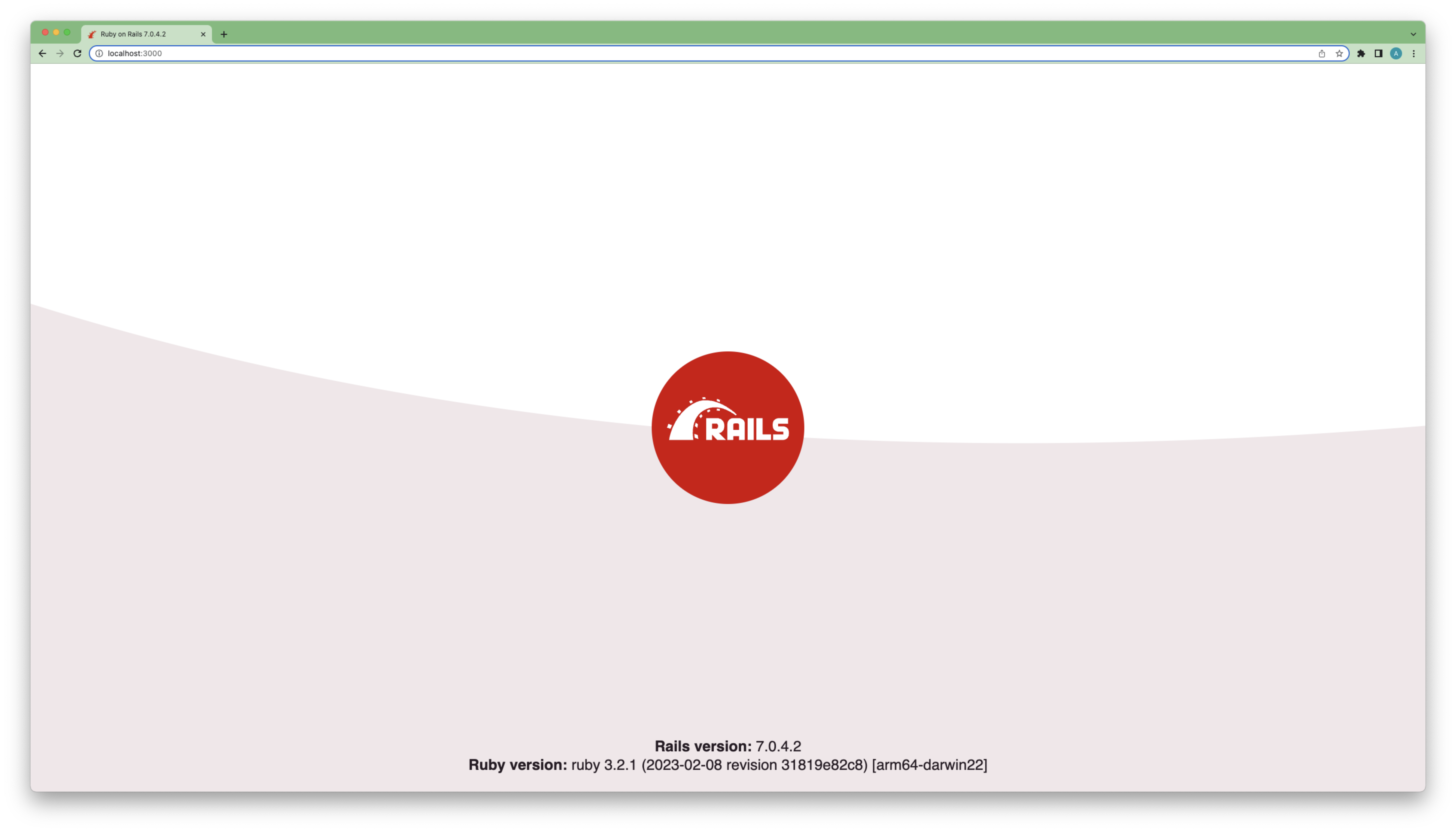
Yay, Rails!
We’re now going to dive straight in and set up ViewComponent and Lookbook.
In the creators’ own words, ViewComponent is “a framework for creating reusable, testable and encapsulated view components, built to integrate seamlessly with Ruby on Rails.”
Lookbook, meanwhile, is “a tool to help develop, test and document ViewComponents in isolation.”
Lookbook’s quickstart guide is amazing. We’ll follow it closely for these first few steps, then we’ll get a little more adventurous…
Let’s first install ViewComponent and Lookbook in our project by adding the following gems to our gemfile:
Install those gems by running the following in your command line:
Mount the lookbook engine in your routes file:
ViewComponent comes with a generator that gives us all the starting files we need for a component. In your command line, run:
This will give us four files (including a preview file thanks to the —preview flag):
Visit http://localhost:3000/lookbook, click on ‘Button’ in the left-hand nav and you should see the following:
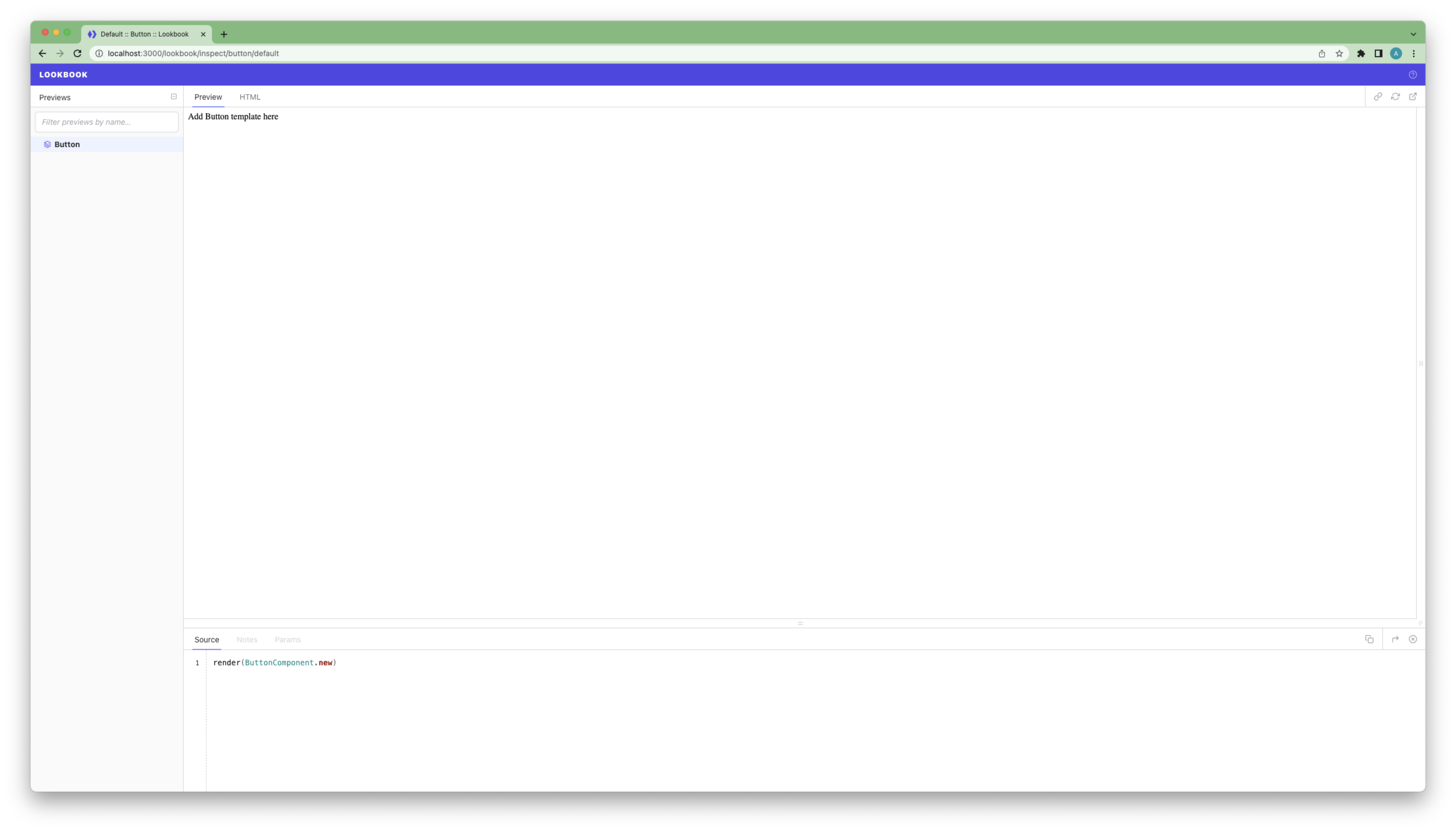
Glorious isn’t it? Not really, I agree. Let’s see what we can do…
We’ll keep this pretty simple, but ultimately we want to end up with a button that has any text the creator desires, along with a set of predefined colour schemes. Let’s jump in!
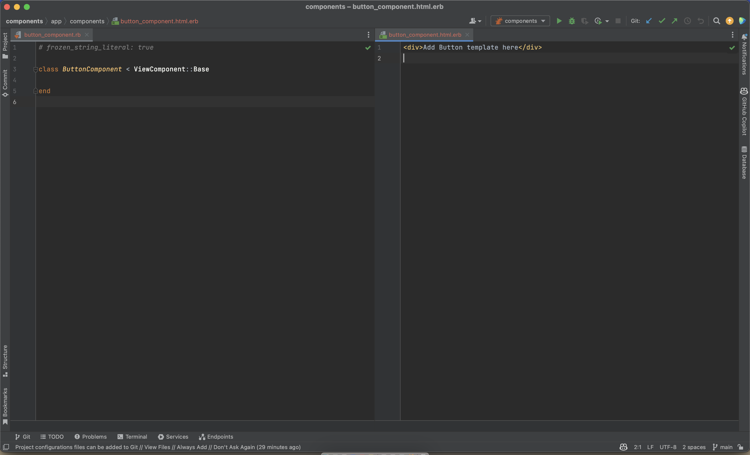
Head to the newly created app/components/button_component.rb file
Also open the newly created app/components/button_component.html.erb template file
I usually like to set these two files up side by side in my IDE like so:
Let’s get a basic button element in using a link_to helper, with some Tailwind styles for later. Replace all text inside button_component.html.erb with the following:
Check your preview to see what we have:
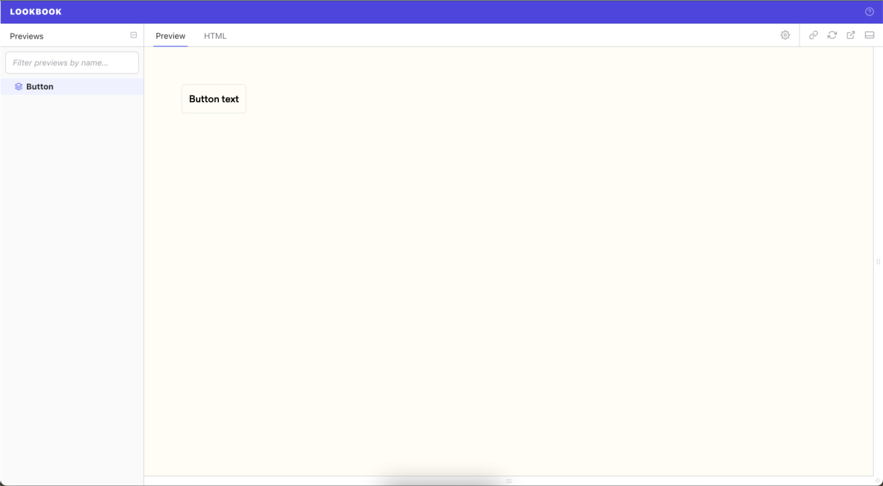
You may notice I’ve done a little foundational work in setting up a layout file, giving us that coloured background and some padding.
If you’d like to do this optional step, head back to the Lookbook docs and complete the short Preview Layouts section.
OK, so we have our super basic button. Lets start with allowing the dev using our component to change the text. Using a ‘slot’ feels appropriate for this task.
ViewComponent’s how-to guide is equally as impressive as Lookbook’s. Head to the slots section.
Seeing as we are not rendering another component, we are going to be using a ‘passthrough slot’, which is achieved simply by omitting a second argument to the renders_one method.
Add our passthrough slot to the button_component.rb file so it looks like this:
Back in the button_component.html.erb file we can replace
with
Meaning your two files should currently look like this:
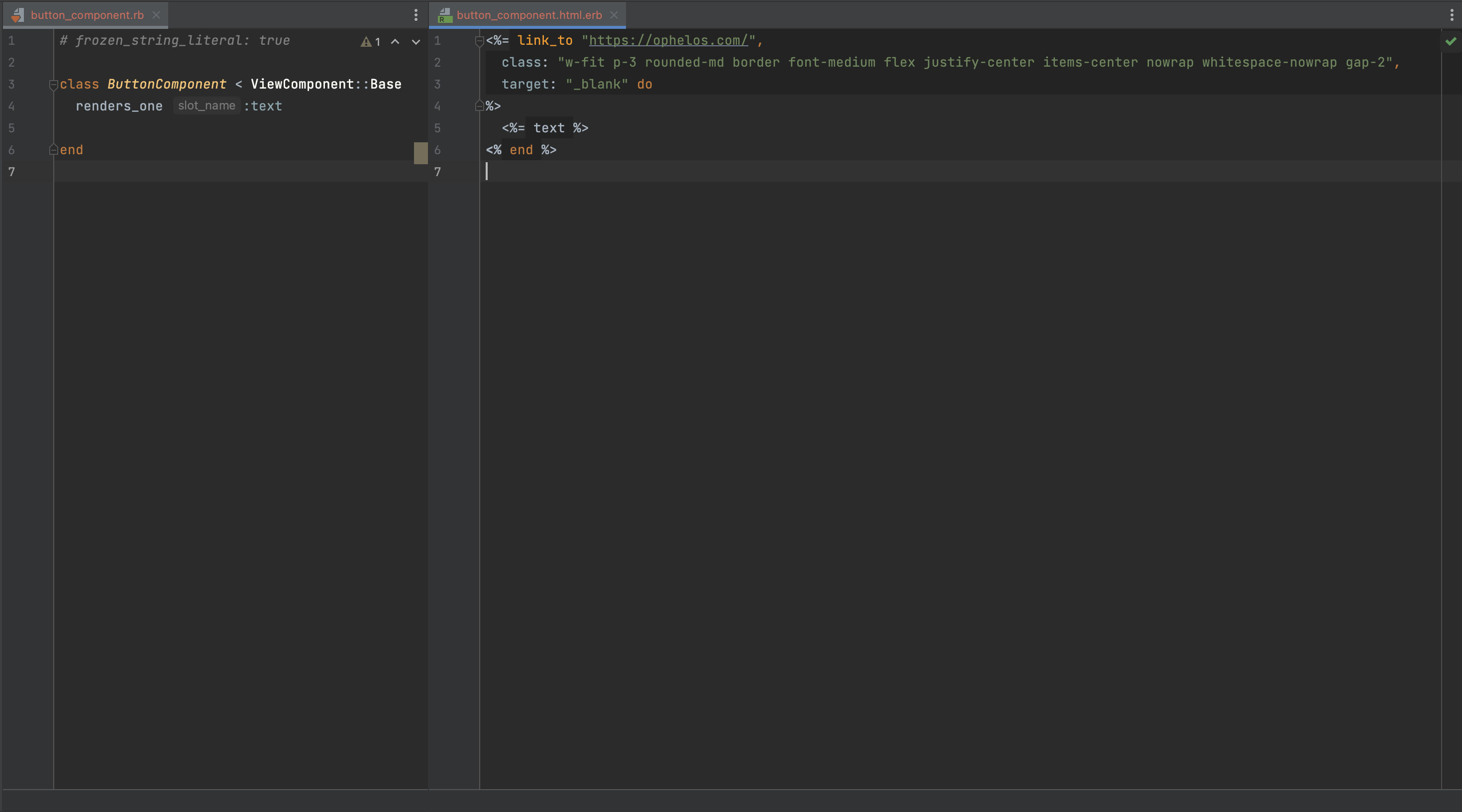
If you visit Lookbook, you’ll notice that your preview seems to have disappeared.
This is because we’re asking our component to render text from our text slot, but we’re not currently passing it anything. Let’s do that now.
Head to test/components/previews/button_component_preview.rb, which currently looks like this:
Open up a do block and pass it your desired text, like so:
Hey presto! Our first dynamic component. Note the source tab - this allows engineers to quickly reference the workings of a component and how it renders.
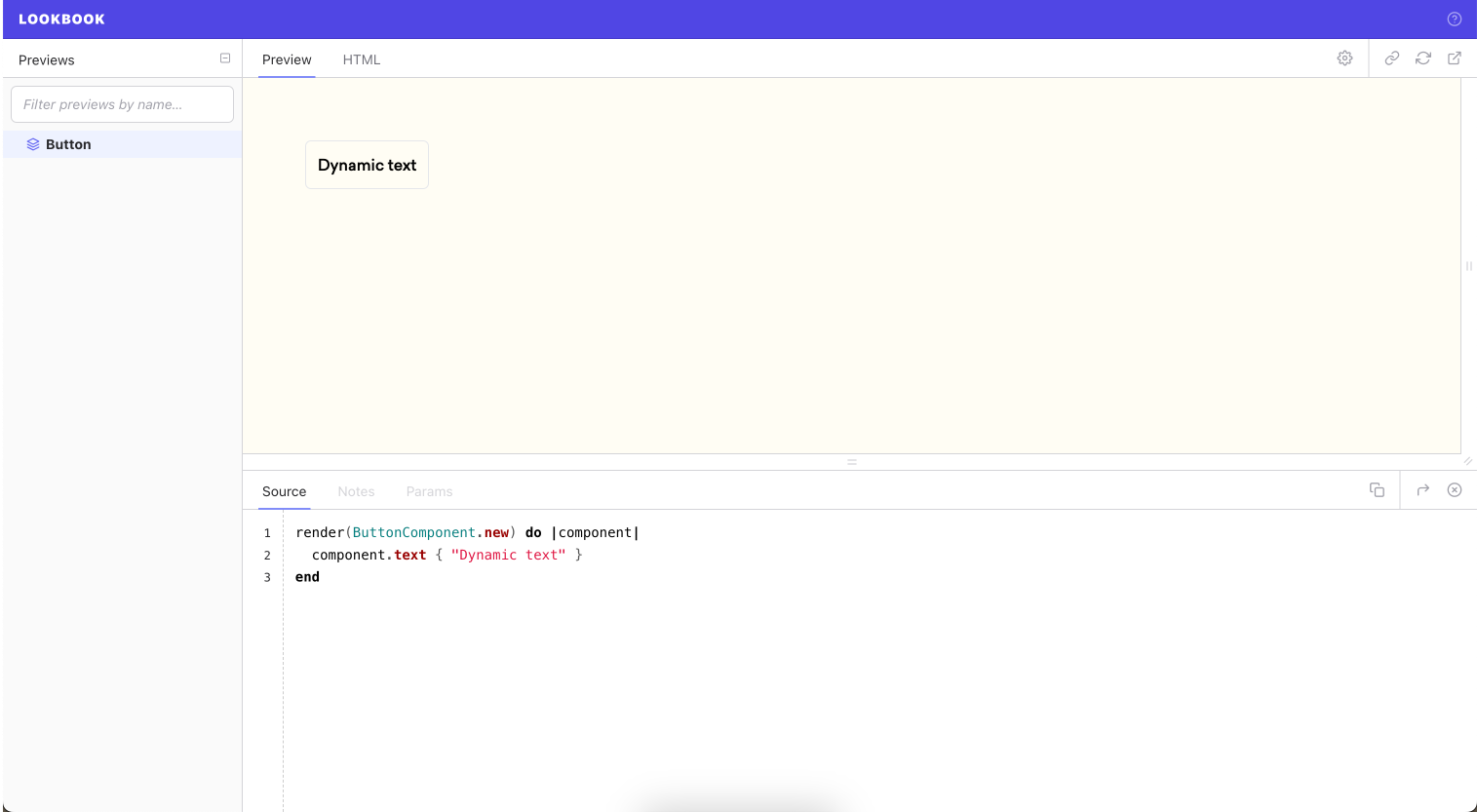
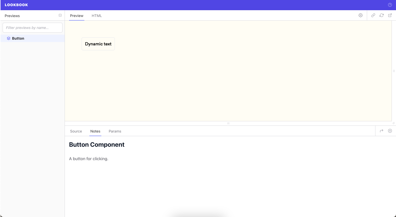
Let’s also add this as a dynamic param to our lookbook preview, along with some supporting docs. You can read more about this here, but for now, get your preview file to look like this:
The first three commented lines give us a title and documentation text for the Notes tab:
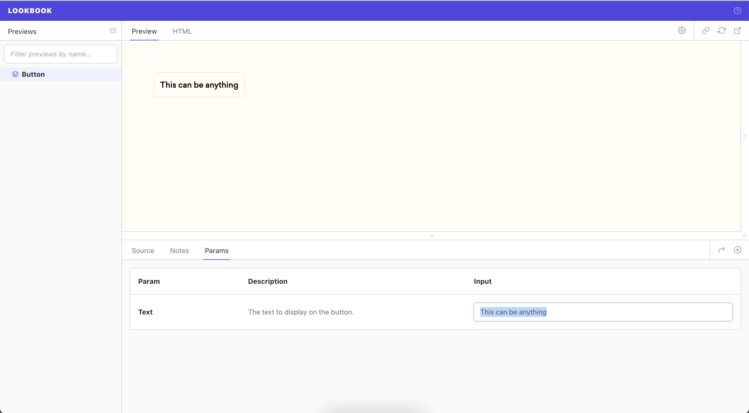
We then add our ‘Text’ param. Text is the name of the param, followed by text again which denotes the type in this case, followed by a brief explanation of what it does.
We’re using this new param to replace the text in the screenshot below:
Finally, let’s add some basic styling for different colour schemes.
First, let's set up our button_component.rb file like so:
So what’s happening here? We’re setting up a hash under the constant name ‘SCHEME’.
This hash holds different Tailwind classes for each scheme inside of it.
Below this we see the initialize block - as you probably guessed, this is what the component initialises with. Here we are saying the component needs to be passed a scheme upon initialisation. If a scheme is not passed manually, it will default to :primary.
We raise an argument error in this block if an incorrect scheme argument is passed - for ease of debugging, it’s a good idea to raise this error here, as close to the source as possible.
Finally, we define ‘scheme’ at the bottom. This is essentially saying “Whatever scheme is passed in, find the corresponding hash key and return that value”. We can then place this in the template to yield the resulting Tailwind classes.
In the template, it’s as simple as adding ‘scheme’ to the class list. Be sure to open up an array, and comma separate the static classes and our new scheme class, like so:
Let’s head back to our preview file and allow for scheme switching:
What’s changed here?
- We’ve added a second param called ‘scheme’ of type ‘select’, and added our options in an array.
- We’re passing scheme and a default option of :primary into the default template for this component.
- Notice in our render block we are passing in scheme. This is the key difference between arguments on initialisation and slots for content. Here ‘scheme: scheme’ may seem a bit confusing but it’s basically saying ‘scheme: :primary’ and pulling the second ‘scheme’ from what is being passed into the default template.
Let’s fire Lookbook back up and see what we have:
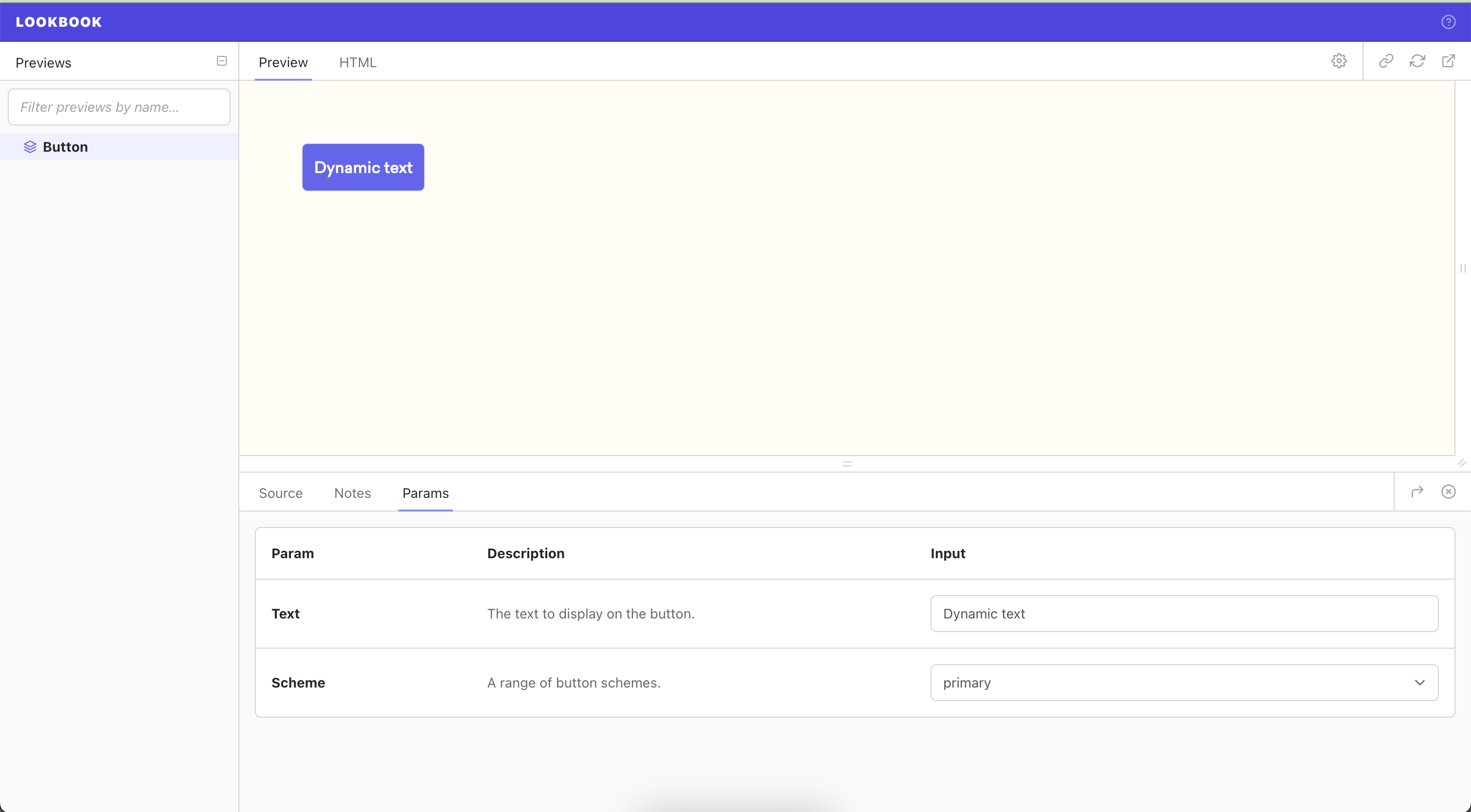


And there you have it!
Hopefully that was pretty quick and painless. Thanks for reading and happy coding!


.png)


